Microsoft has released the preview version of Fluent XAML Theme Editor for the developers who are using at least Windows 10 SDK Build 17723. The tool is publically available to the Insiders in Github repository for testing. You might have this tool in your memory as they offered a tool in Build 2018 session that set color theme for your app using ColorPaletteResources API.
You can download Fluent XAML Theme Editor preview version from Github and start coloring your app now. We will here with the details of the methods to use it to Refine colors, Create, save, load presets, Check Contrast Ratio, Export and apply to the theme.
How to Use Fluent XAML Theme Editor
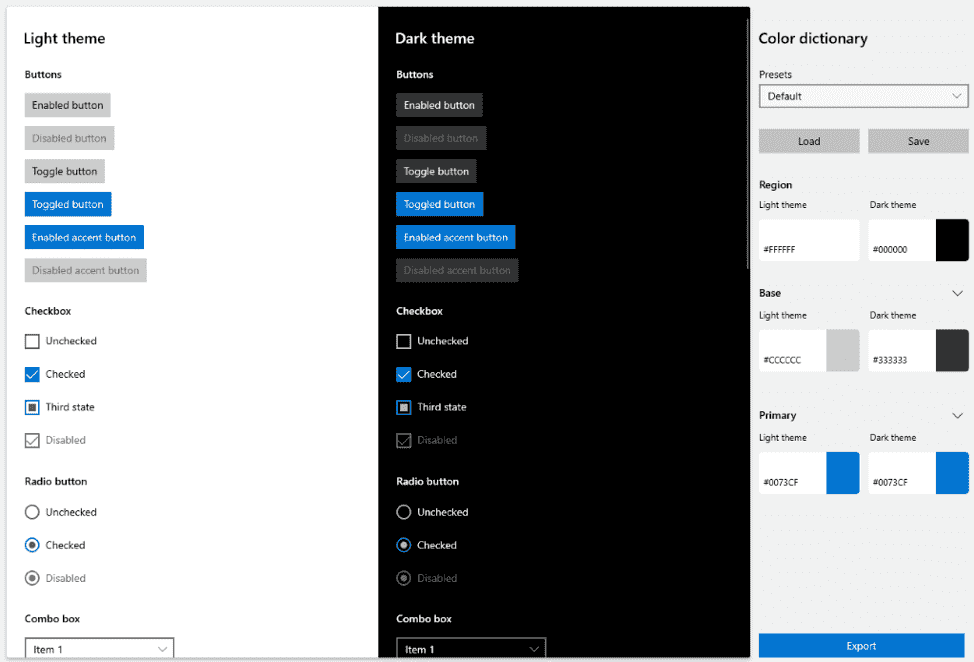
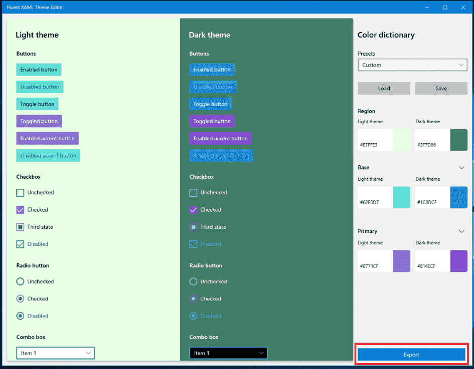
Using the preview build, you are able to select 3 major colors for both the Drak and Light themes in the right-hand properties view labeled Color Dictionary –
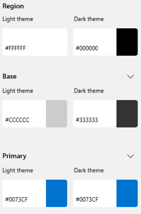
- Region – This is the background that all the controls (commands) sit on, which is a different resource that does not exist in our framework.
- Base – This points out entire controls’ backplates and their temporary state visuals such as hover or press. In common situations, Base will be in contrast with the background (or Region color). You should use black text (if in Light theme) and white text (if in Dark theme).
- Primary – is indefeasibly the Accent color and should contrast with mainly white text.
Color Dictionary is used in more choice locations to display alternate rest states for toggled controls. These are list selection, either checkbox or radio button checked states, slider fill values, and further control parts. The choice locations need to be exhibited as different from their default rest state once interacted with.
Refine colors
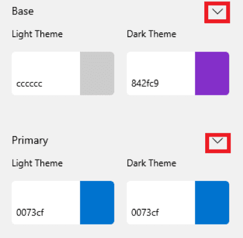
You have the ability to extend either of the 3 principal colors to perceive a list of the minor colors that alter it on certain controls on an additional refined level.
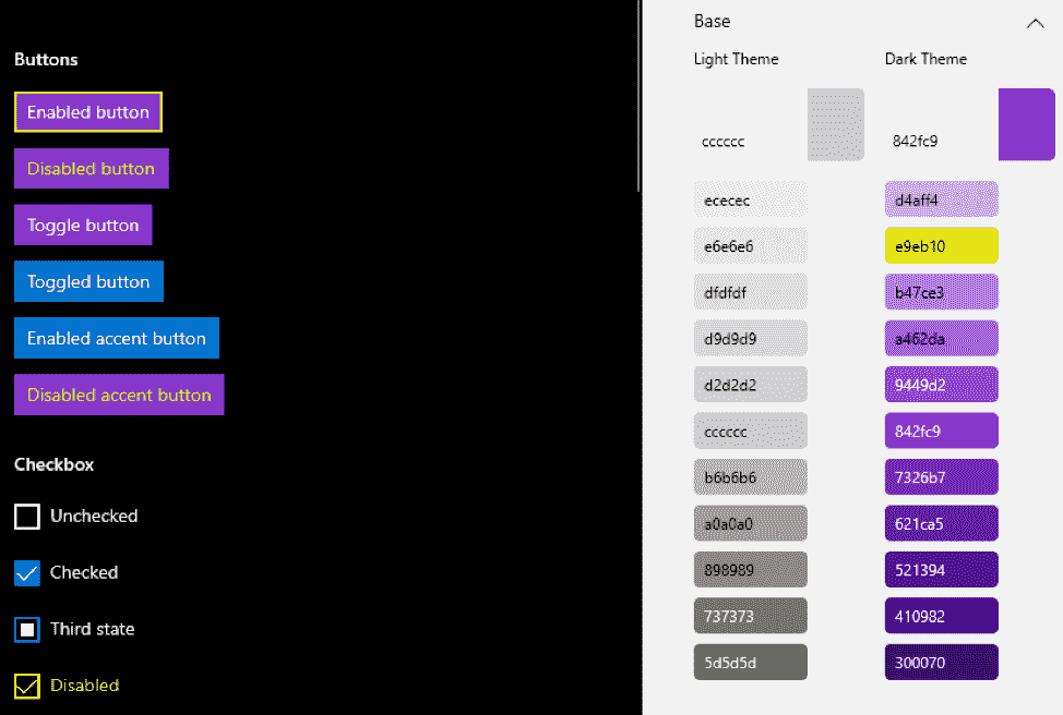
In the above instance, you’ll notice that however, your major Base color is purple in Dark Theme, you can override that second gradient value to be yellow to change the borders and disabled color of controls.
To expand the detailed view, click the chevron ahead of the major color buttons:
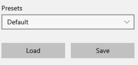
Create, save and load presets
The editor includes some presets to get the view of what a theme looks like in the application.
The preset dropdown is located at the uppermost part of the Color Dictionary properties panel.
When you initially boot the tool it will always be set to Default – which is the Dark and Light theme styling default for all our controls. You can choose a variety of themes such as Lavender and Nighttime to understand how the tool will theme the controls.
When you’re all set to start creating your theme, just begin editing the colors! Once you’ve commenced tweaking on the editor, the Presets ComboBox goes from the name of the preset to Custom –
This indicates that you’ve begun a new temporary theme that’s Custom. The changes you make will not affect any of the other Presets in that box.
- Once you are ok with the changes, simply click the Save button and browse to your desired point.
- In the same way, you can get access to your saved JSON theme by clicking the Load button and browsing to your saved theme’s file location.
Check Contrast Ratio in Fluent XAML Theme Editor Preview app
Finally, you must be a contrast compliant while making your theme. You will find a small list of contrast information on the left side of the color selection window when selecting your color.
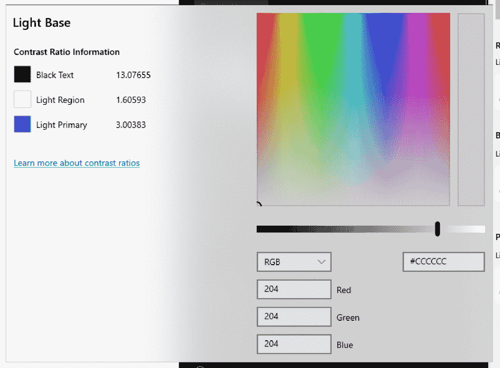
Here, you will find your contrast with the most prevalent text color in the theme that you are selecting to edit. In the above situation, this will be black text since you are editing a Light theme color value.
You will get a warning next to your contrast value when your chosen color falls below the standard contrast ratio of 4.5:1.
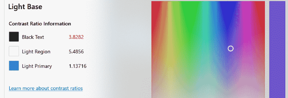
To learn the detail follow – contrast ratios and their importance.
Export and use your theme in an application
You will need to click the Export button from the bottom of the Color Dictionary properties panel to use it in your application.
A popup window will appear with a generic, unnamed ResourceDictionary stub.
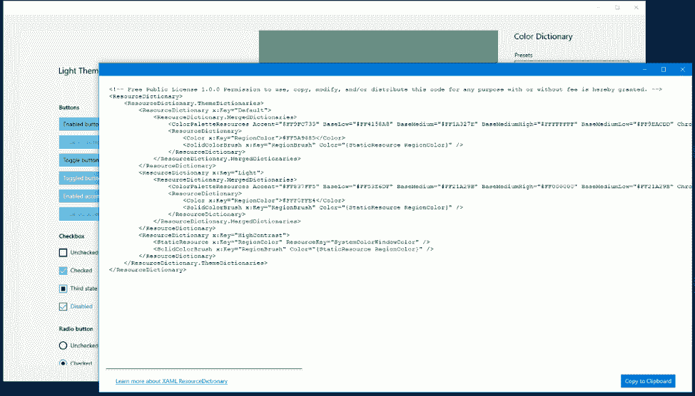
However, you don’t need to be concerned because the window doesn’t make anything final. In case, you want to make some changes re-export the window, it will refresh with your changed colors.
Once you have made up your mind to use it in your application, click Copy to Clipboard button in the lower right and navigate to UWP Visual Studio solution.
When you have come to Visual Studio, right-click on the project solution, available in the Solution Explorer.
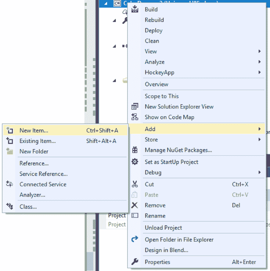
And follow Add => New Item and then select Resource Dictionary.
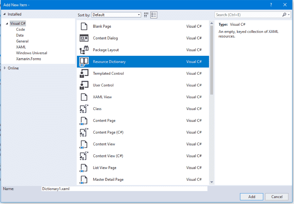
Name that dictionary that makes sense to you and click Add when lastly.

That should create an empty ResourceDictionary like this –
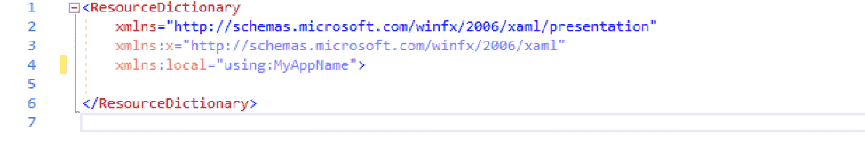
Now you are able to paste the exported theme code from the editor into that ResourceDictionary.
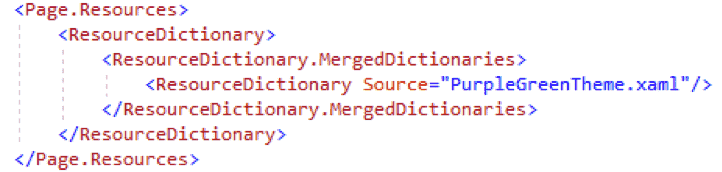
Finally, you have a fully customized color theme for Microsoft store app, therefore let’s apply it!
So you’ll want to access your page or app.xaml (based on how much of your app you want the theme to apply to). After then merge your theme dictionary into the resources of that page or application.
Lastly, have in remembrance to set the background color of your page to the RegionColor that you have chosen for your theme. It’s the only brush that won’t be configured automatically.
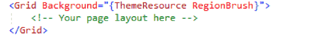
At last, Colors of your theme will now be pervasive across your application or page depending.
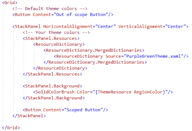
Scoping your theme
Rather if you desire to scope your theme colors to a lesser area, you can also put all that power into just a container (such as StackPanel or Grid). The theme will scope to simply the controls that live under that container –
Using your theme down-level
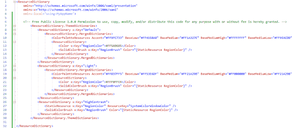
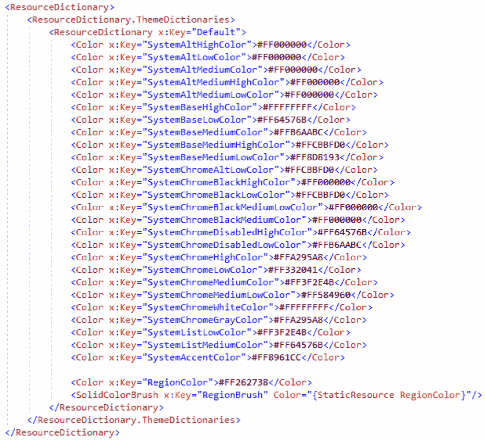
When you export your created theme, you’ll notice a “ResourceDictionary” markup with a “ColorPaletteResources” definition as follow –
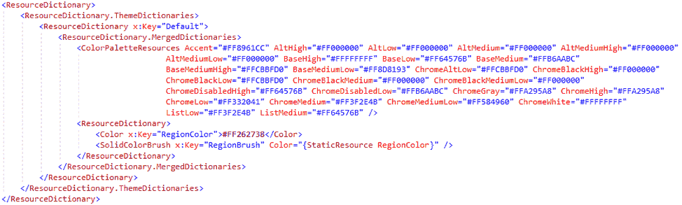
ColorPaletteResources is a friendly API (Application Programming Interface) for the SystemColors that sit within generic.XAML and permits for those SystemColors to be scoped at any level.
In case, you wanted to use the same theme to work downlevel, you would have to define each SystemColor discontiguous with each color from your theme –
In the mentioned case, you are looking at the Lavender theme to display this down-level transition.
However, in the previous SDK than 17723, this markup format modification will also enable your theme but it will not work on the control scoped level, page, or container. “ColorPaletteResources” is the API (Application Programming Interface) that allows scoping behavior. This markup format will only be useful at the app.xaml level for older SDK.
Get started today
To start with the Fluent XAML Theme Editor preview now, advance to the GitHub repo for the app.
Source – Windows developers blog.